The quality of form design, in general, on the web continues to be a huge source of frustration for users and an embarassment for all of us who are involved in designing and building sites.
Here is a payment page that I needed to traverse recently:
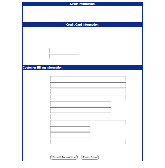
Firstly, as originally served:
And, here once I’d disabled CSS:
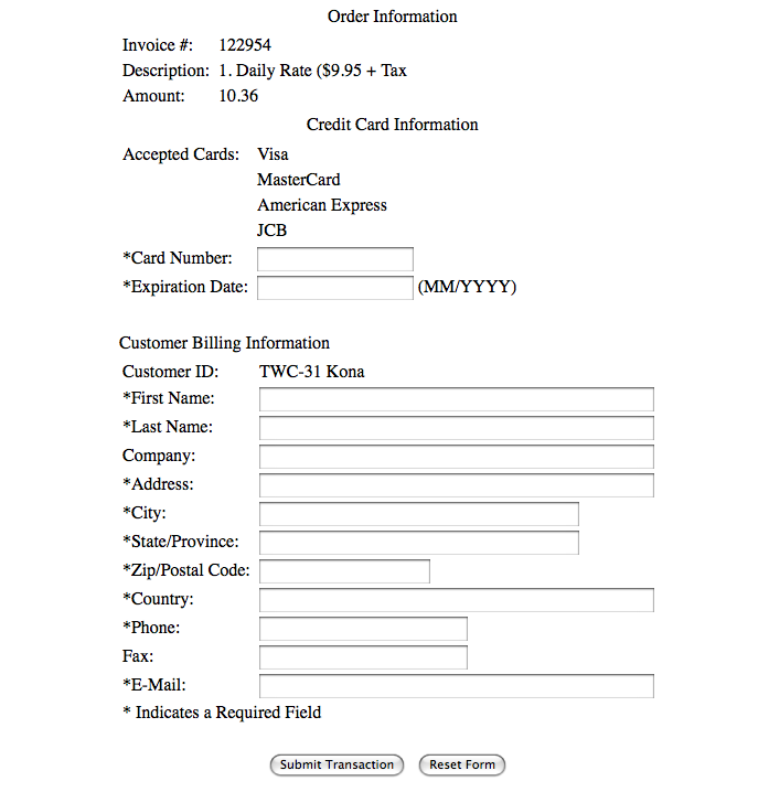
It took me a few attempts to even work out what was happening. Initially I just assumed that the page had somehow not completely loaded.
Then I highlighted the area where the labels should be and realised that they were actually white text on a white background!
I’m guessing that in this case the design is incompetent rather than malicious.
Perhaps it works fine in Internet Explorer? Who knows.
I was determined, so worked it out. But, I expect I’m an exception.
If they measured their conversion rates on this page, surely they would find that a significant number of people simply give up, unable to work it out.
So, you have to assume that they probably never bothered to measure.
Of course, none of the intelligent and experienced people who take the time to read this blog would ever make a mistake as outrageous as that. Would you?
You might be surprised :
Let me try and debunk some axioms of registration page design, and in the process highlight a simple mistake that I would guess many of you have made without even realising it (I can only say that with confidence because I’ve made it myself many times).
To start, a question: what is the difference between these two forms?
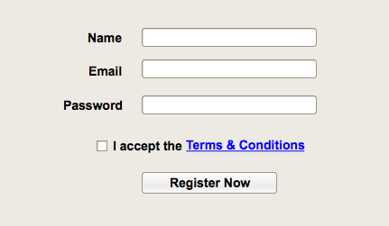
Form A: with tick-box
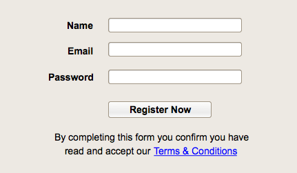
Form B: without tick-box
Which is easier to use? Or, to ask the same question in a more measurable way: which would have a higher conversion rate?
As we’ll see there is evidence to suggest that Form B is a much better design.
So, why are registration pages like Form A nearly ubiquitous?
Here are some possible reasons I can think of (if there are others, please let me know):
Legal reasons
In case it’s not obvious, I’m not a lawyer!
If there are any lawyers reading I’d be interested to get an informed opinion on this.
My guess is that it doesn’t make any material difference.
Just think about how this would sound in court: “But, your honour, they ticked the box when they registered!”. Yeah, right.
And, even so, at what cost this additional legal protection? How many fewer registrations can you afford before it’s worth taking the risk?
Because everybody else does
This is probably getting closer to the major reason for the ubiquity.
And, there is something to be said for consistency. But, surely only when it doesn’t hurt! Lemmings!
Just because everybody else does something, that doesn’t excuse us from measuring and understanding the impact of our design decisions.
How hard is it to tick a box?
Now we’re getting to the interesting bit:
I was recently talking to Nigel about some of the work he did on improving the StarNow registration page. This is the first example I’d come across where somebody had actually taken the time to measure specifically where people were failing on this sort of registration form.
It turned out, in their case, that 27.9% of people didn’t tick the box the first time, and as a result got a validation error. What’s more this only compounded other problems. When the tick box validation error was displayed the password fields were reset (as is common, unless you explicitly set these values when the page is returned, which is frowned upon by security types). So, of course, many people would read the error message, scroll down and tick the box, only to find that the form still didn’t submit successfully as they also needed to re-enter the password.
Does this sound familiar? I know I’ve been through this exact dance myself many times, and I consider myself a pretty savvy web user.
Overall they found that over 34% of people who attempted to complete the page (i.e. pushed the submit button at least once) abandoned the site without successfully completing their registration process.
By making simple changes they decreased this to 17%. That’s a staggering 26% improvement!
So, some suggestions:
- Ditch the tick-box from your registration page.
- If your lawyer complains ask them to justify the cost, which you will now be able to quantify.
- Re-populate password fields on post-back. Or, if you’re not comfortable doing that for security reasons, at least highlight the fields that people will need to re-enter to avoid further error messages.
- Most importantly: take the time to measure and understand exactly where people are failing on your site, then do something about it!