I want to walk through an example of getting a diagnosis for Dr SaaS, to show how easily you can do this for your SaaS business, and what sort of analysis you can expect to get out of it.
To get some numbers to use for this, I’m using the Demo Company which is available in Xero (if you’d like to play along at home, log into Xero and look at the bottom of your My Xero page for a link to your own copy of the Demo Company).
For the purposes of this demo I’ve changed two of the accounts to better match the sort of expenses you might have in a small SaaS business: “Subscriptions” is now “Staff Costs” and “Rent” is now “Hosting”, otherwise the data is straight out of the box.
Step 0: Getting Started
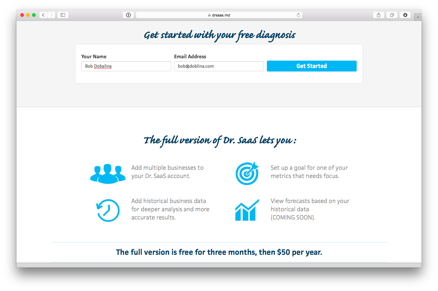
Visit https://drsaas.md and click the big orange button on the homepage:

Enter your name and email address, and you’re underway:
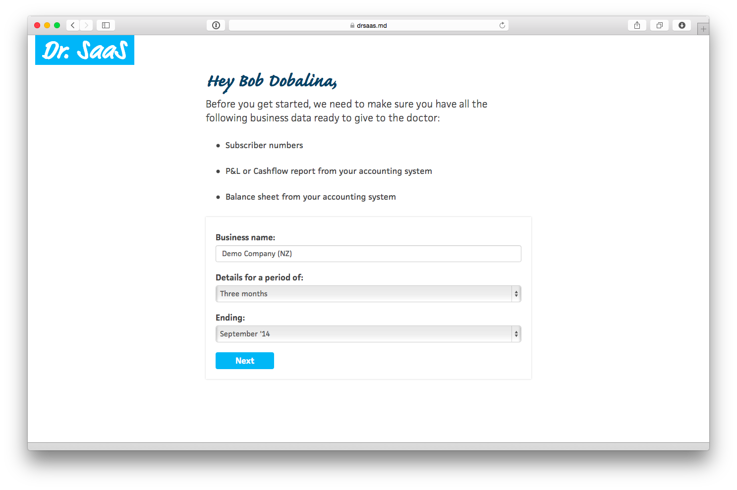
Enter your company name and select the period you wish to analyse. In this case I’m going to use the details for the last quarter ending Sept ’14:
Step 1: Revenue
This step collects details about subscribers and revenue, and calculates growth, churn and average revenue values.
We will need to make up the subscriber numbers, as there are no details about this in Xero. When you’re doing this yourself, you can get your subscriber numbers from your customer database or billing system.
Firstly, enter the number of subscribers you have at the end of the period. This should include both free and paid subscribers, if you have both. We will say 598 subscribers at 30 Sept.
Secondly, enter the number of new subscriber you acquired during the period. This should count every new subscriber who joined during this time, even if they have already cancelled. We will say 186 new subscribers between 1 July and 30 Sept.
Thirdly, enter the number of cancellations during the period. We will say 98 cancellations between 1 July and 30 Sept.
At this point we already have our first metrics calculated, showing the growth rate, churn rate and average tenure:
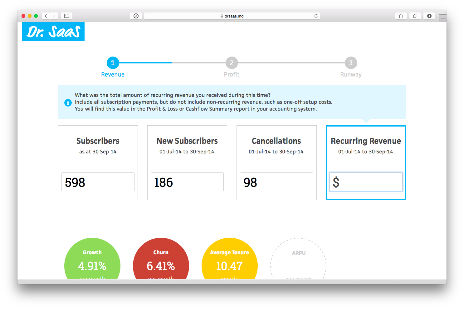
Finally, enter the amount of revenue received during the period. To get this you need to open Xero and run the Profit & Loss report:
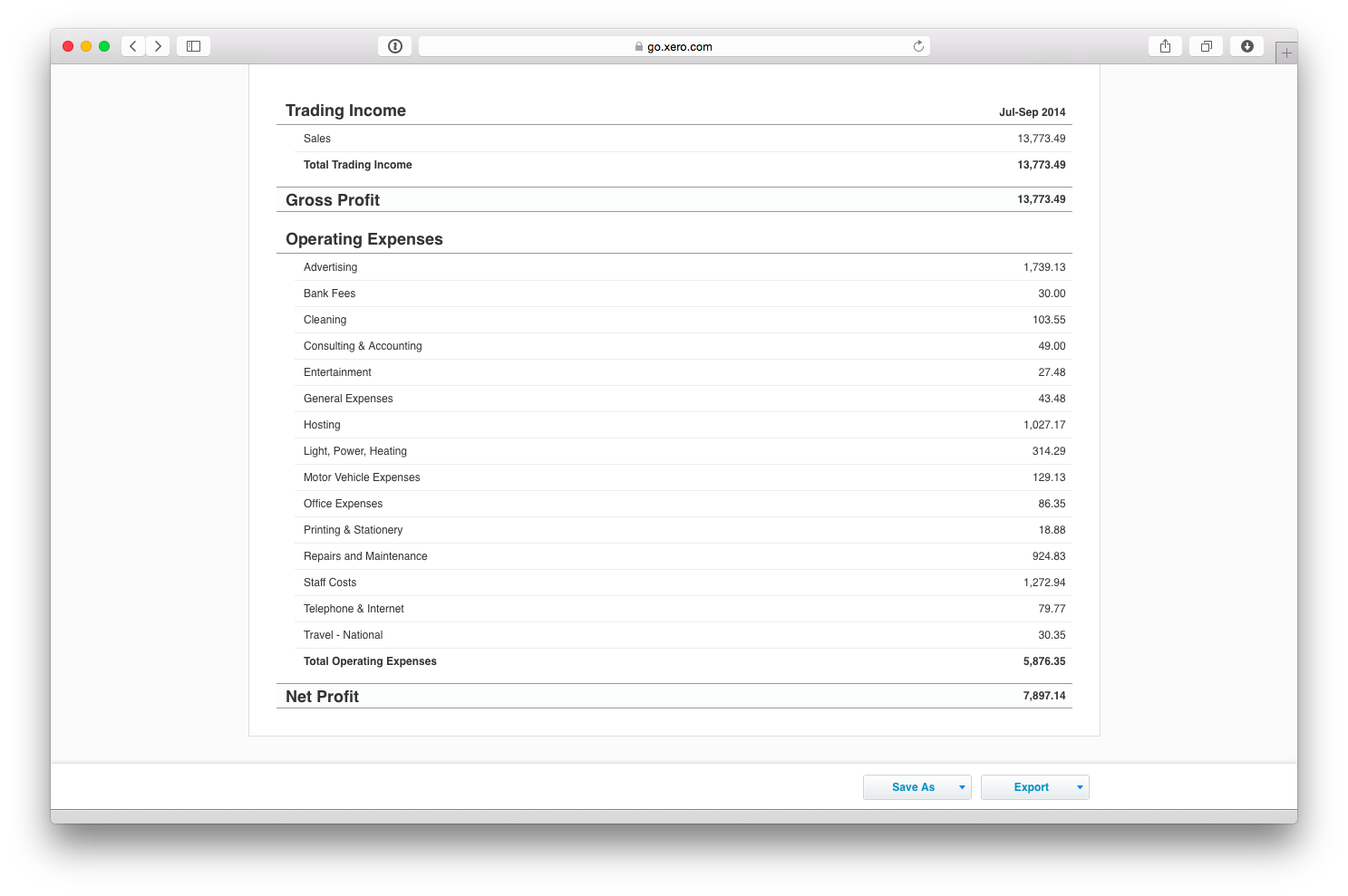
The revenue number is shown at the top. If you have other revenue you should only count recurring revenue from subscribers at this stage (other revenue will be entered separately in Step 3 below).
In our example, there are sales of $13,733 showing in the P&L, so we enter that value here.
This then calculates the fourth metric on this page, the ARPU or average revenue per user. This is the amount you earn on average from each subscriber each month:
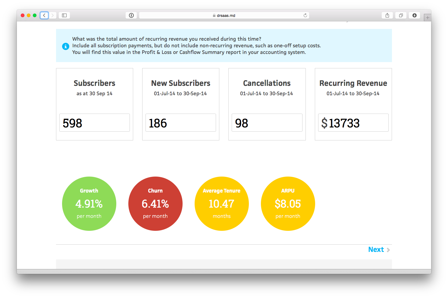
Already we have some useful information - the growth rate is 4.91% per month, which is okay, but churn is 6.41% which is very high and means that on average each new subscriber only sticks around for just under 10.5 months, on average we earn $8.05 per subscriber per month, which doesn’t leave a lot to play with.
Step 2: Profit
This step collects details about how much we spend acquiring and servicing subscribers, and calculates our cost of acquisition, cost to serve and also profit margin.
Before you can complete these inputs you need to split the various costs showing on the P&L report into three categories:
- Acquisition costs - i.e. all sales and marketing costs, commissions, discounts and related staff costs.
- Service costs - i.e. all support and hosting costs, payment processing and related staff costs.
- Operating costs - i.e. everything else! (note: we will enter these costs in Step 3 below)
In our example, we will treat “Advertising”, “Entertainment” and “Printing & Stationary” as acquisition costs, and “Hosting” and “Telephone & Internet” as service costs. We will also split the “Staff Costs” into thirds and say one third of this amount is spent on acquisition and one third on servicing subscribers. It can help to get out your highlighter at this point, to keep track of which expenses you have entered:
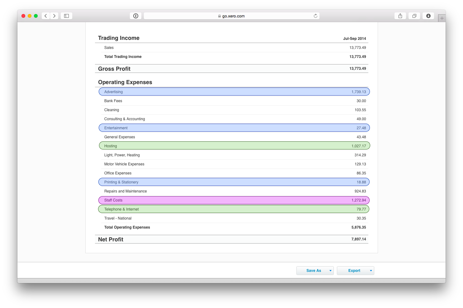
Those add up to $2209 and $1531 respectively, so we enter those values here:
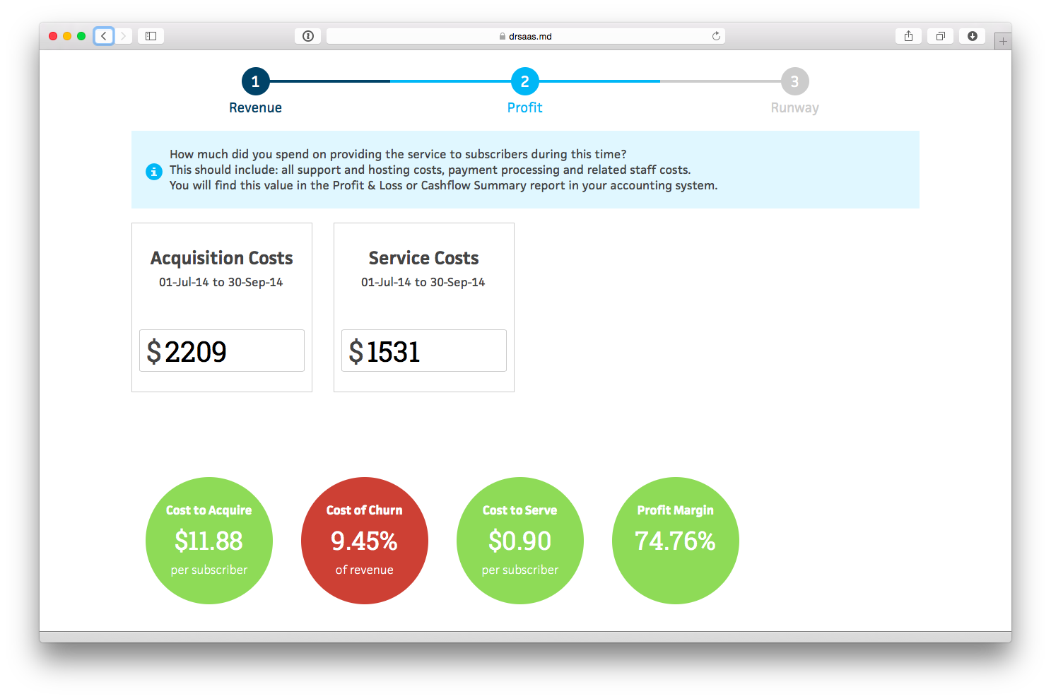
You can see from the bubbles at the bottom that we’re currently spending $11.88 to acquire each new customer and 90c per month to service them, which leaves a profit margin of 74%, which isn’t bad. But, again, the problematic value which is highlighted is the cost of churn, which is the effective amount spent each month to overcome churn - i.e. we currently spend 9.45% of all of the revenue we earn each month to acquire new subscribers to replace those subscribers who churned.
Step 3: Runway
This final step collects the remaining details about expenses, and also how much cash is available to cover these expenses, to calculate a burn rate, breakeven target and cash runway.
Firstly, we enter the details of other revenue and other expenses not already included above:
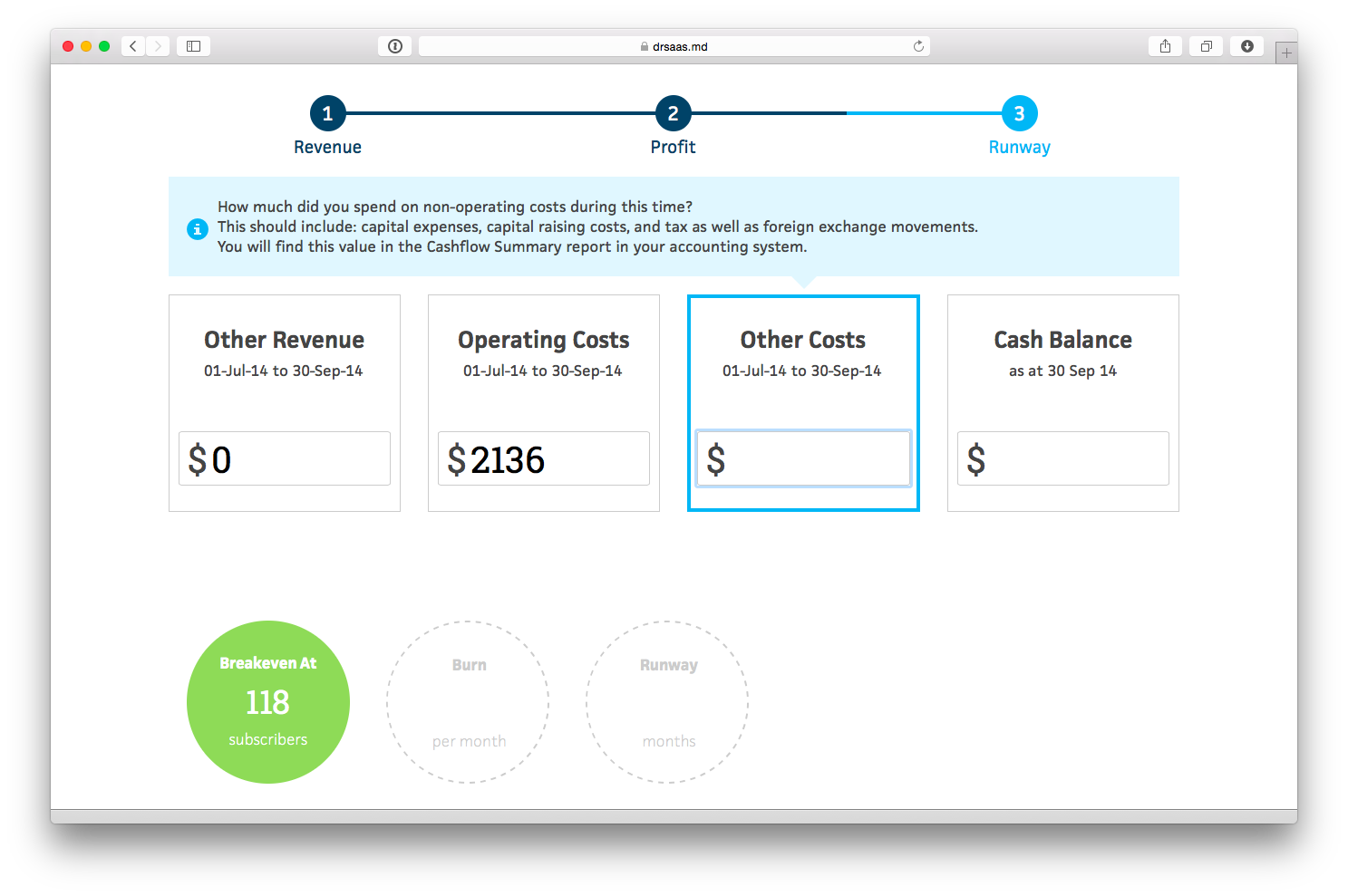
From this we can see that the calculated breakeven target is 118. This shows how many subscribers are required in order to cover all of the operating costs and other costs, given the current business model. In our example, this is good news as we already have more subscribers than this.
However, we have not yet considered the other costs which are not included in the P&L, such as capital expenses, capital raising costs, and tax as well as foreign exchange movements. To get these we will need to look at the Cash Summary report in Xero, which shows that during the period we spend $1652 on computer equipment, so we enter that here.
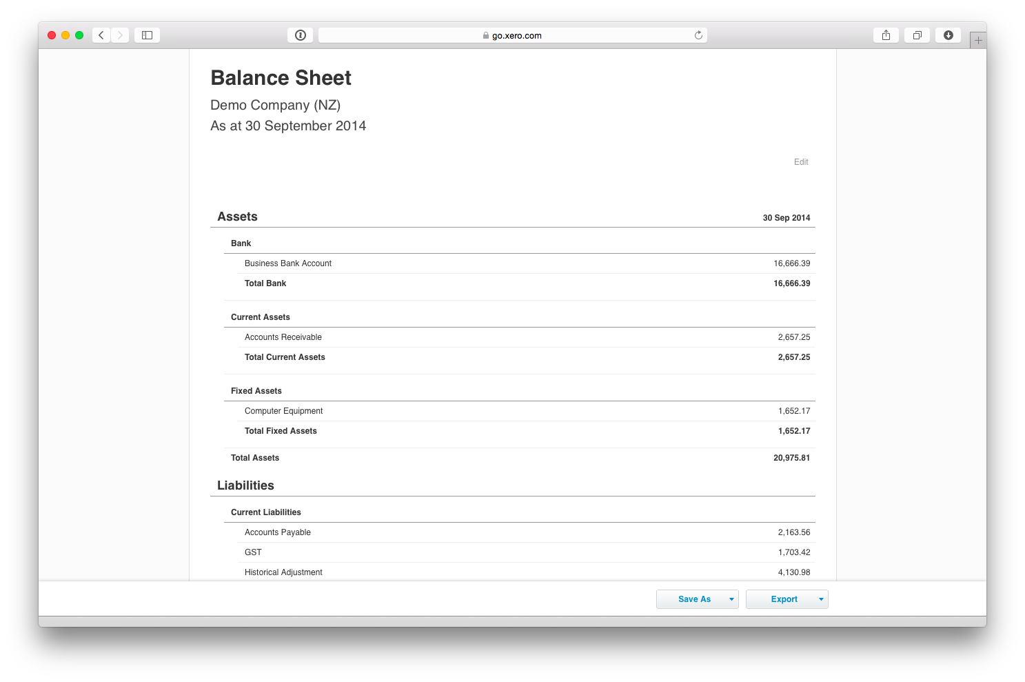
Finally, we need to look at the cash on hand in the Balance Sheet report in Xero.
In our example, the bank account has $16,666 at 30 Sept:
At this point we get the calculated burn rate and runway. In our example the burn is negative, so the runway is effectively infinite, but assuming you’re not yet making a profit these values will show how much cash you burn each month and how many months you have left assuming current burn rates.
Step 4: Diagnosis
That’s it. We’re done!
The final page shows the summary diagnosis:
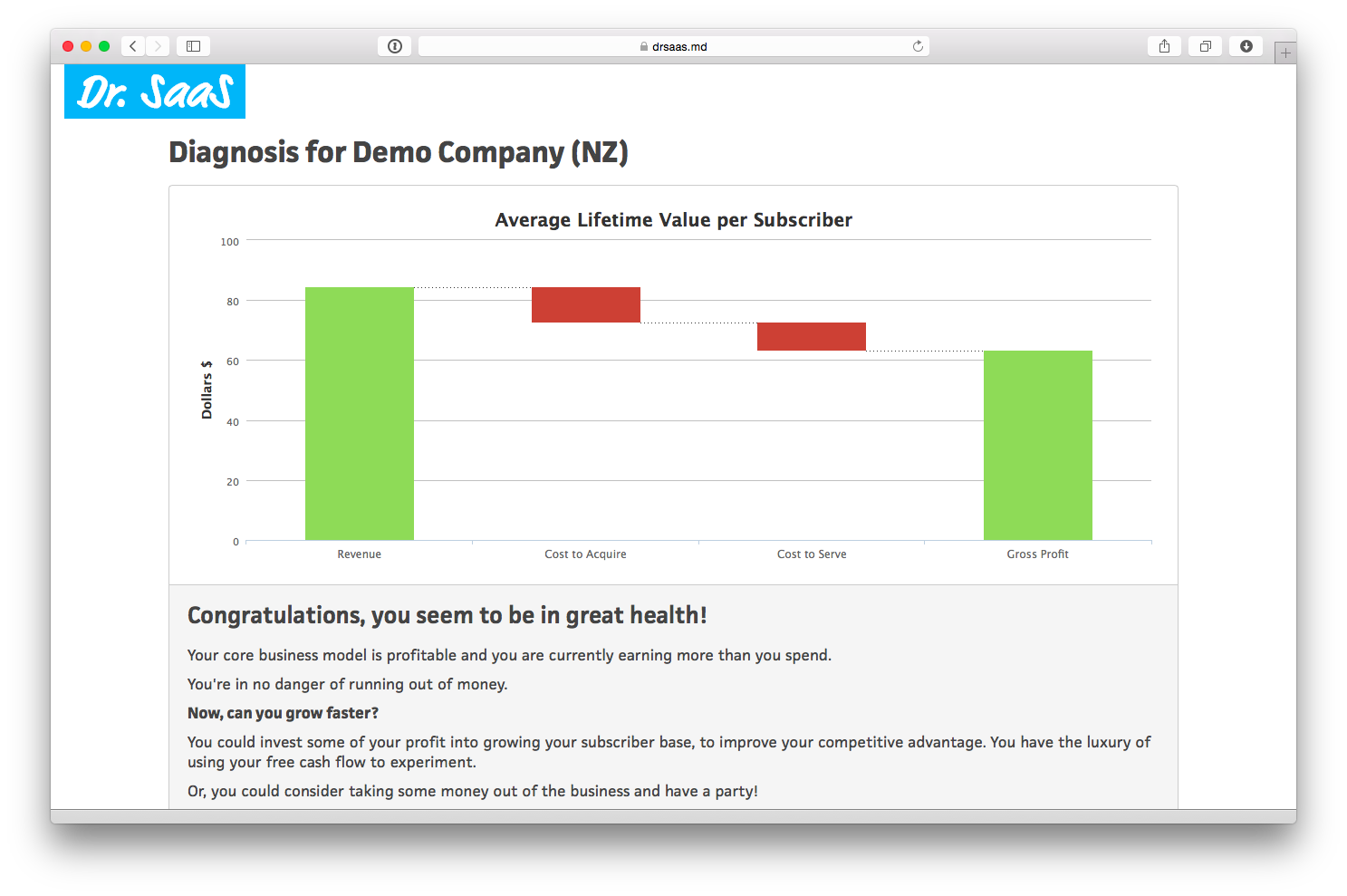
This graph can be a bit confusing at first, but is actually simple. It shows the lifetime value per subscriber.
The green revenue bar, on the left, shows the total amount of revenue you can expect to earn from a new subscriber on average. In our example, this is $84.29. The value is based on the average tenure of a new subscriber (derived from churn rates) and the average revenue per subscriber.
The two red bars in the middle show the cost to acquire and cost to serve, again over the lifetime of the subscriber. In our example these are $11.88 and $9.40 respectively.
The bar on the right shows the remaining gross profit - i.e. revenue less costs. If you have a profitable business model then this bar will be green, as in the example above. Otherwise this will be red, meaning you are effectively losing money on every new subscriber!
Below this is a brief description of your unit economics. This will be customised to the values you have entered:
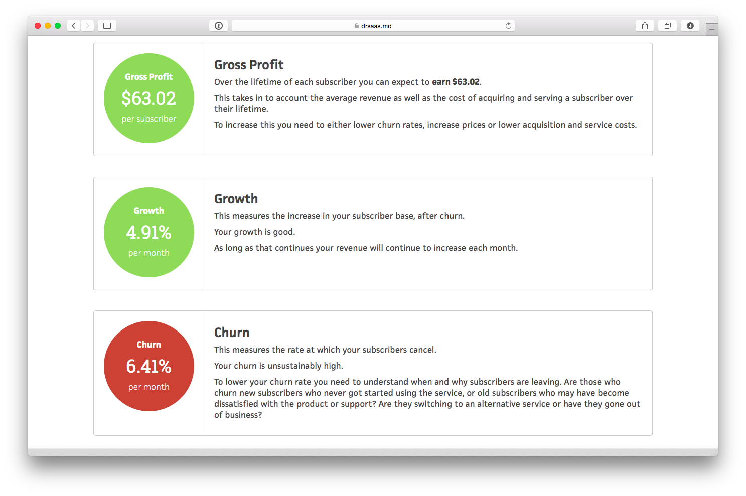
The second part of the diagnosis highlights specific metrics which are relevant to your situation. In our example, it shows the gross profit value of $63.02 and growth rate of 4.91%, which are both positive, and also highlights the high churn rate of 6.41%. Again, the metrics that are displayed are different for each company, depending on the values that have been entered and the things you should be focussing on.
From this page you can choose to save the diagnosis, which allows you to share details with others on your team, enter multiple months to keep track of the full history, and setup a goal for one of your metrics that needs focus. You can also enter values for multiple businesses and switch between them easily - great for people like me who spread their time across multiple companies.
Please, try it out for yourself now: https://drsaas.md
