Motion Charts in Google Spreadsheets

Slightly old news, but anyway …

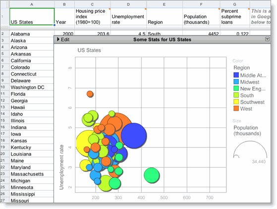
Motion Charts are now available in Google Spreadsheets.

These were originally made famous by Hans Rosling.  If you haven’t seen his TED talks please start here:

This seems like a solution itching for a good problem.  

These charts can easily handle five dimensions of data: x-axis, y-axis, bubble size and bubble colour + time scale.

Does anybody have an interesting and available data set like that which we could all use to play with?

Bonus points for NZ data. :-)

6 Responses to “Motion Charts in Google Spreadsheets”


  1. 1 Ed Corkery October 17, 2008 at 10:14 am

    Might work well for visualising some types of geology data, which can have x,y,z,time components as well as multiple attributes for each data point.

  2. 2 Leonie October 17, 2008 at 10:19 am

    I’ve had a play with this over some data and it works really well. Have you checked this out for data http://www.stats.govt.nz/Infoshare/database/snz/databaseSearch.asp ?

    Rowan- maybe you could have a competition to see who can create the most compelling and insightful visualisation NZ Stats data??

  3. 3 Miki October 17, 2008 at 1:02 pm

    I have used this type of chart to size different sub-elements of mobile internet product categories.

    Someone from McKinsey will have great suggestions I am sure :)

  4. 4 Rowan Simpson October 17, 2008 at 8:20 pm

    From Chris Auld via email:

    http://www.stats.govt.nz/products-and-services/media-releases/corporate-communications/infoshare-mr.htm

    Stats have now made Infos freely available… All the data you could ever want…

  5. 5 Mike October 19, 2008 at 2:18 pm

    How about volume of trades per major section (bubble size/colour) against NZ GDP (Y-axis) vs total TradeMe users (X-axis) vs time? Would see new bubbles appear for Jobs, etc as they came on stream.
    Maybe something with more fine-grained data than GDP?

  6. 6 Ossama November 12, 2008 at 12:01 pm

    Epic Systems together with Beemode (www.beemode.com) have developed a Data Visualization software “Trend Compass” almost ready to be released soon. It is an extension to Gapminder which was invented by a Swedish Professor. You can view it :

    - http://www.gapminder.org

    It is a new concept in viewing statistics and trends in an animated way and viewing 4 axis instead of just the traditional X and Y axis. It could be used in analysis, research, presentation etc.

    Here are some links :
    - A project we did with Princeton University on US unemployment :
    http://www.epicsyst.com/main3.swf

    - US Population from 2004 till 2030 for ages 0 - 83 focus on Baby Boomers and turn the Trails off (uncheck)
    http://www.epicsyst.com/Pop/Babyboomer.swf

    - April 2008 Media Monitoring on Cars and Beverages TV ads (ads Duration vs Repetition per Day over time) :
    http://www.epicsyst.com/ads/cars.swf
    http://www.epicsyst.com/ads2/bev.swf

    - Ads Monitoring on TV Sattelite Channels during April 2008. Pick Duration (Ads daily duration) vs Repeat (Ads repetition per day).
    http://www.epicsyst.com/ads3/allchannels.swf

    Next one is my favourite it covers a lot (change the X and Y coordinates) and it accumulates his earnings too, 43 Million USD :
    http://www.epicsyst.com/sampras/sampras1.swf

    I hope you could evaluate it and give me your comments. So many ideas are there.

    You can test the software by uploading data on our website and getting the corresponding Flash charts. This is for a limited number of users.

    Regards.

    Ossama Hamed
    http://www.epicsyst.com

Leave a Reply


Contact Details

Rowan Simpson
PO Box 3210
Wellington, 6140
New Zealand

Latest Links

Books for sale

Buy my old books at Fishpond

Fishpond Logo Borderless

Categories

Policy

These words are my own. Please don't assume that they represent the opinion of any other person or organisation.

And, if you want to quote me please either ask first or provide a link back.