The fairy tale version of coming up with a new product idea is the eureka moment. But, real life is not always a straight line. Sometimes you stumble across an idea in quite an indirect and seemingly random way.
Once upon a time …
One of my favourite apps, back in the day, was FavIt by Tim Haines. It would display a single tweet at a time (based on top-ranking favourites from the FavStar.fm site). You could flick left and right to navigate through the list or pull down to reveal more information about the tweet and its author.
It was a delightful and tactile app, and I would often find myself soaking up the odd spare moment I had when out and about during the course of a day to be entertained by some funny tweets.
Sadly, it didn’t survive the transition to the new Twitter API, and eventually stopped working altogether.
Mourning its demise, we got to talking about what other types of app would work better with a scroll view rather than a table list view.
One idea was dating, and that turned into a bit of a rabbit hole that we went down for a while. However, as I’ve written about previously, the best things to work on are things you care about, have authority in and are prepared to take responsibility for, and that particular idea didn’t really chin any of those three bars for us.
So, we kept looking.
Then one day Koz suggested email. Genius!
We seem to spend a lot of time fighting our inboxes.
That’s certainly something we’d care to fix.
Imagine if there was an app that let me use a spare 5 minutes here and there to quickly filter out all of the emails which I can just read and delete, so that when I get back to my desk I only have to deal with the messages which require a bit more thought and attention".
Wouldn’t it be better if the inbox on your phone was just the new messages which have arrived since the last time you checked.
What I really need is something which forces me to do something with each message one at a time, rather than presenting an overwhelming list of unread messages, that I just end up scrolling back and forth through without ever really dealing to at all.
You really should pay attention to sentences that start with “imagine if…” or “wouldn’t it be better if…” or “what I really need is …”. There is gold in them there hills.
We didn’t, of course. At least not immediately. That idea just sat there ruminating. Anyway, who would be stupid enough to build an email client, that sounded like a lot of work…!
But, like all good ideas, it kept coming back and demanding some more attention.
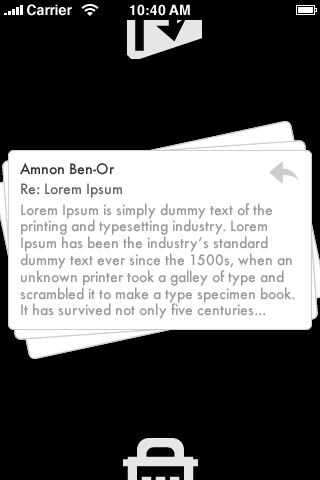
Amnon took that the original idea, and came up with the concept of a stack of cards, one for each newly arrived email message, which you could quickly and easily flick up to archive or flick down to keep for later.
This was an early black-and-white wireframe:

When he showed it to us we were both immediately angry that it didn’t already exist.
Koz meanwhile had decided that building an email client wasn’t that hard (!) and had started working on that.
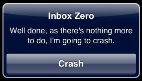
Before too long we had a rough prototype. Very rough. For example, when you got to the bottom of the stack it simply displayed this message, which was elegant in its direct simplicity, if nothing else:

We decided to share it with some friends anyway. There were some early hiccups (“Archive” can be interpreted to mean “Delete” in some circumstances, right Karl?) Overall the feedback was really mixed. It didn’t fit with the way that everybody used email, and not everybody had the problem we were solving, but those that liked it loved it, which was really encouraging (note: if you’re testing something and don’t hate it, be sure to tell the developer that, your feedback will likely be much more positive than you realise).
It seemed that this was a thing that some people might want. Ideas like that don’t come around everyday, so we continued on.
You know what this is like… it’s like triage in an emergency room".
And so we had a name for the app. Triage. It’s first aid for your inbox. Perfect.
After a few months and a lot of work, and a bunch more beta testers, and a bit more feedback, and some minor tweaks to the original concept, it eventually got to the point where we weren’t horribly embarrassed by it anymore. And what’s more we were using it ourselves all the time - I’d long since relegated the old Mail app to the folder on the last page along with Maps, Compass and Voice Memos, with Triage taking its spot in the dock.
We pitched it to some of the speakers at Webstock, who couldn’t have come to Wellington at a better time in this process. We were flattered when they loved it and offered to introduce us to others in their network who might be interested.
The last piece of the puzzle was an icon. We wanted something that would belong on the homepage of your phone, and after a lot of work from Amanda, heaps of different concepts and some help from our friend Bryan in the US we eventually came up with something that we all liked.

All that was left were some final improvements to animations, and some additional fun features such as the achievement stamp for getting to the bottom of the stack and the card wiggle if you tap on one of the arrows, plus a one-page marketing site, and we were ready to submit and now today, make it available for sale.

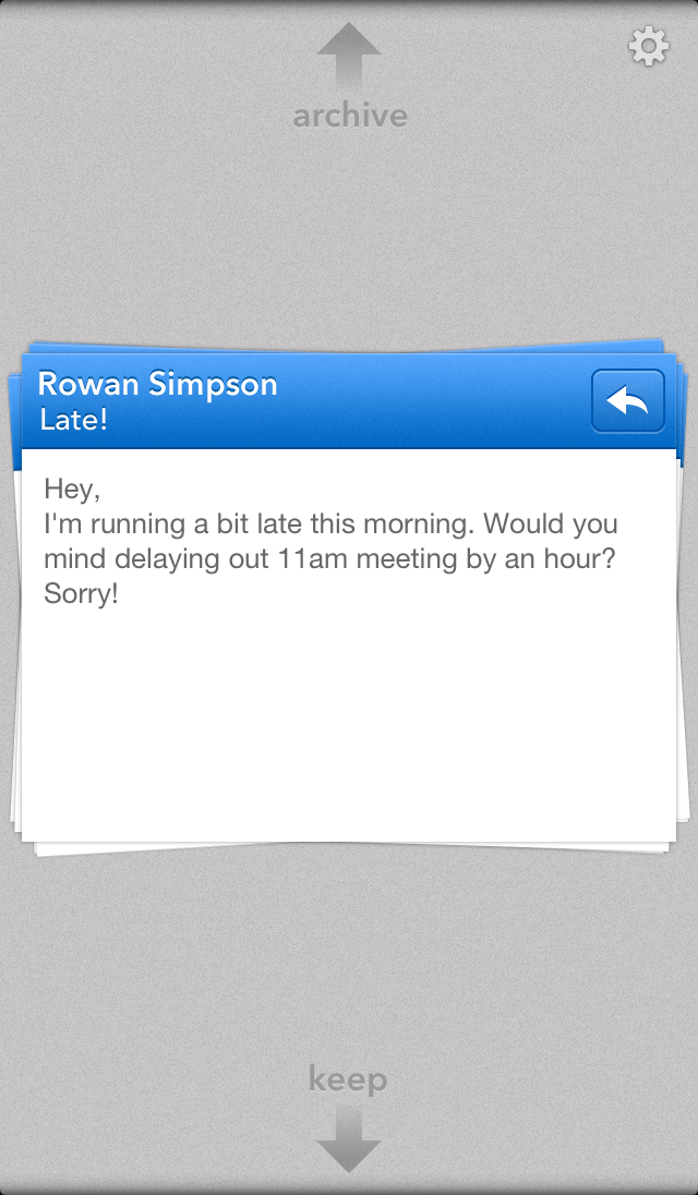
(the team were very kind to include an unflattering message from me as the official screenshot, complete with spelling mistake!)
And so…
I’m sitting here trying to come up with a succinct myth to describe how we got to this point for a blog post, and I’m thinking that the reality, far too long and not easily compressed into a soundbite, is actually much more interesting. Perhaps you won’t mind?
I hope lots of you will be tempted to buy it and use it. We’re hopeful that sales will justify the time we’ve invested in it, of course. But, mostly we’re just excited that people will get to enjoy something that we’ve made with pride and will find it useful.
If you do, it would make us happy to hear from you and even happier if you would tell your friends.
And, if you don’t, let us know too, so we can maybe make it better in the future, or at least be amused by your witty one-star review.
Either way, Triage: Email First Aid is available now. Go get it.
UPDATE (20-April):
Here are a couple of early screen casts that Koz sent me, which capture some of the UI under development: