Dear John,
It seems my last letter struck a chord with many.
I didn’t set out to advance a movement. I wasn’t even the first to write about the Red Peak flag after the current shortlist was announced. I was simply expressing my disappointment at the options. There seemed to be no choice.
We were promised four choices for the first referendum, but in the end have been presented with a single solution - four variations of a fern.
Here is something that might surprise you … just like you and lots of others, I love the Silver Fern.
It’s an enduring and unique symbol. It’s widely associated with New Zealand and New Zealanders, and is the only symbol most of us would pick if we had to choose a single icon to represent our country. It is something we should all be proud of.
It is most commonly associated with our sports teams and specifically with the All Blacks. But, of course, it goes much wider than that. It’s extensively used, in business and trade, tourism, on our money and our passports, and importantly on the headstones that commemorate our fallen soldiers.
For these reasons I’ve long been an advocate for a Silver Fern flag. I was pleased to see a simple Silver Fern on Black design included in the long list.
But, as we now all know, there are a number of reasons why that sort of simple Silver Fern couldn’t be considered for selection - most importantly that it is almost impossible to design a flag featuring a fern that doesn’t look like one of the many other existing trademarked designs.
Of course, the Silver Fern is not part of our current flag, and whether it’s included in the design of the new flag or not, it will still to be our national symbol. We will continue to use it everywhere we do today, and no doubt find even more uses for it in the future.
That’s not the question. The question is: what is the best design for the flag, given we can’t use the simple Silver Fern?
This is what first attracted me to the Red Peak design. As the designer Aaron Dustin explains on the Red Peak website:
The Red Peak flag was intended to be a ‘new’ symbol that expressed our NZ identity while avoiding the use of Southern Cross, koru, kiwi, and fern motifs.
In just a month, since the long list was announced, and especially in the last week, since the current shortlist was announced, this elegant and considered design has received an overwhelming amount of support, from a wide cross section of New Zealanders. Very few of those people were engaged in this process before, if we’re honest. They are now! This is the first sign that people actually do care about changing the existing flag. Let’s not waste that.
Because it uses an abstract geometric design, its symbolism is less obvious. It isn’t just a rehash of existing symbols to fit on a canvas. You need to take a bit of time to understand the meaning and story behind the shapes and the colours. It allows room for each person to add their own interpretation.

This is why it’s no surprise that when asked, based just on the shapes, it didn’t rank very highly in public polling. It’s like asking people to choose their favourite singer just based on a photo. But, it’s also why, once people were given the opportunity to consider it in context, it has resonated with so many and become their preferred option.
If you reduce many of the great flags to their shapes and colours they are also meaningless. The Japanese flag is just a red circle. The French flag (like a lot of other flags for that matter) is just three rectangles. The Union Jack is just some lines and triangles. The Stars & Stripes is … well stars and stripes. It is the story attached to these shapes and colours which give all of these flags great meaning. And, it’s the same with Red Peak.
The fact that, like them, Red Peak is a simple design, means that it stands strongly alongside all of these examples, and all of the other great flags. The same cannot be said for the other designs in the current shortlist.
Here is another wonderful thing if, like me, you love the Silver Fern on black: the Red Peak design stands strongly alongside the Silver Fern too. It complements. It makes it look better. Again, unfortunately, the same cannot be said for the other contenders, which compete for attention.
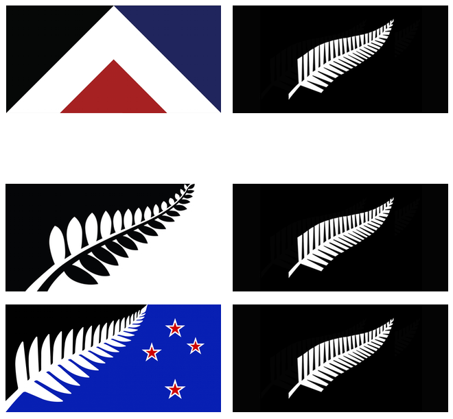
So, it’s disappointing that the current short list doesn’t include the Red Peak option. It would be great to have the choice, and to leverage all of the engagement and support for replacing the current flag which has been generated in the last week.
However, it’s not too late. It would be really easy to make this change. Even more so, because the current shortlist includes those two identical designs. All Cabinet needs to do is to pick one of those and replace the other with this Red Peak design by Order in Council on Monday. You can do this. Then we can have a process which includes real choice.
That would be choice, eh!
So, John. I ask again, respectfully: why not give New Zealanders a real choice?
Regards,
Rowan.
This was first published in The Spinoff.