It’s not what the software does, it’s what the user does that matters.
There are only two industries that refer to their customers as users: high tech and illegal drugs. Is this the company we want to keep?
— Jimmy Gutterman
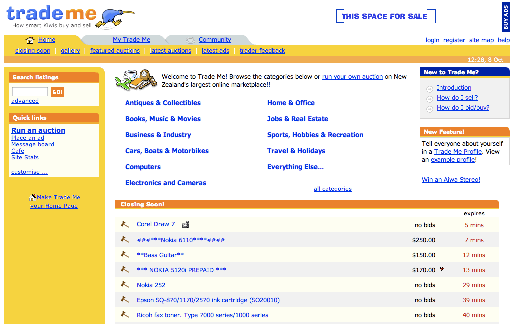
In 2001 we completed a major update of the Trade Me website, including a brand new user interface. We started using the now iconic Kevin the Kiwi logo, drawn by Nigel. He was originally brown, as you’d expect, but the colour scheme was bright yellow and orange we decided he needed to be blue.
Trade Me homepage, post re-design in 2001
Shortly after the launch I was talking with a well known designer from a large corporate who condescendingly described our new look-and-feel as “Tommee Tippee”, referencing the popular brand of children’s feeding bottles. I was initially offended but eventually decided to take it as an unintended compliment. We were aiming to build a website that could be used by anybody, including lots of people who at that stage were not even on the internet. It needed to be obvious.
To achieve that we relied on conventions: our logo was in the top left of every page and linked to the homepage; we used lots of tabs to represent navigation options; links were blue and underlined and contextual; buttons looked clickable. And we used some other less obvious design tricks: we used big fonts because they were easier to read and forced us to use fewer words; we were careful to never break the “back” button that inexperienced users depended on when browsing; we understood that some people prefer to browse while others prefer to search (about 50:50 as it turns out) so we accommodated them both.
Being conventional is the exact opposite of being innovative. None of those things impress fancy designers. But I eventually realised those weren’t the people we needed to impress.
Anybody building software starts with the same goal. We all want to have lots of happy customers.
And yet, most software is terrible. It’s complicated; it’s unreliable; and it’s bloated with options and settings, which often feel like a long list of secret handshakes that we’ll never learn.
It’s actually even worse than that. Because those of us who build software are so rarely in the room with people who are using what we build, mostly these frustrations are invisible and overlooked, if not completely ignored.
According to Don Norman, usability legend and Apple’s VP of Advanced Technology between 1993 and 1998, there are three evaluations required at the inception of any new product: 1
Marketing - what people want
Engineering - what can be built
User-experience - how people like to do things
Most product teams don’t do this. We focus on the things we can build rather than the things we should build. Or we just just ask users what they want.
Even that is complicated. Henry Ford apparently said “If I asked people what they wanted, they would have said a faster horse”. As a horse owner I’d prefer a horse that poos less. They are fast enough!
We need to aim higher. The challenge isn’t to make it possible for people to use the product successfully. The goal should be to make this the default.2 Or, in the very least, by far and away the majority outcome. Somebody using it for the first time should be able to just follow their nose, make the obvious choices, and end up in the right place.
Getting to the third user
There is a pattern in software development that I’ve seen repeated so many times now that it’s worth codifying:
Imagine we are observing the first usability tests on some software we have built.3
The first user completely misses the seemingly obvious cues in the user interface. The button might as well be big and red and flashing, but they just don’t see it.
“Dumb user” everybody thinks.
The second user also quickly ends up hopelessly lost.
“Two stupid users in a row … what are the odds?”
The third user. Same story.
At this point, we’re all hopefully slapping our foreheads and thinking “how could we do this better?”
The key is getting to the third user. Until then we haven’t really learnt anything.
This exact same pattern applies to bug reporting, once the software we’ve built is out in the wild. The first alert is probably random noise, the second is annoying, the third is a sign that there are actually two problems: something is wrong with the software and something is wrong with the people who ignored the first two warnings.
Of course, that assumes that we’re tracking errors or bugs in the first place. It is surprising how often that isn’t the case.
Rather than treating testing as validation, we need to have the mindset that we’re likely wrong and that users can teach us to be right.
Humble design
Having users invariably makes us wrong. Then, hopefully, it makes us humble.
People are complex. It’s easy to say we just need to imagine being in their shoes, or watch them while they use our software, or be more mindful of errors that are reported. But actually we need to get in their heads and try to understand their context. We need to be aware of other tools they use and are more familiar with that will inform how they expect our new thing will work.
That’s difficult and time consuming work.
When we get carried away by the buzz of building something new, and get sucked into the challenges and complications involved in engineering and construction, it easy to forget our goal should be to build a “pit of success” 4 - a shallow hole that people will just immediately fall into without even having to think about it, ideally without even realising it, and which leads them in the correct direction. We need to make this the path of least resistance, like a water slide. Once we get people moving they should gather momentum and slide on down.
(When we see people repeatedly taking a different route then we should also pay attention to that, rather than putting up fences to stop them going that way - sometimes “desire paths” reveal a different and better product.5)
If we don’t have happy users, it’s not their fault. It’s our fault. We didn’t make it easy enough. We can do better.
It’s not what the software does, it’s what the user does that matters.
Preaching to the choir
People who work on startups typically like to spend time with other people who are also working on startups. That makes sense. It’s often a lonely experience, and it can help to share that with others who empathise.
It’s important to realise:
These are easy conversations.
A lot of people have opinions about startups. It is a broad church. We need to filter a lot of noise in order to get to the signal.
Working with the Timely team taught me a better approach.
In the beginning we incorrectly called ourselves a technology company targeting customers in the health and beauty sector. That seemed logical. We were software people. They were health and beauty people.
But eventually we realised we were ourselves part of the health and beauty sector and that our product was technology services.
This might seem a subtle difference, but it resulted in a significant change in how we positioned ourselves, how we spent our time, and who we spent it with.
Rather than talking mostly to other technology people, who were all working in very different sectors, we prioritised talking to our peers in the health and beauty sector. We quickly found we had a lot more to learn from them.
Rather than describing our technology and listing the features we had built, we switched to focusing on the problems we were hoping to solve for our customers and talking about our solution using language and a style that was more familiar to them.
Rather than spending all of our time with other startup founders who were the same age and stage as us, we tried to connect with those people who understood the most about the customers we were trying to reach. Some of them were self-employed. Some of them were working in much larger businesses. Some of them became customers themselves or referred others. Some of them would even later join our team.6
As we discovered:
These are hard conversations.
There are always opportunities to learn, and bouncing off others who are in a similar position and struggling with similar problems can help. However a good question to ask is: what do we disagree with? If we already believe everything that is being said at the events we attend then we’re probably not learning much.
It’s important we don’t spend too much time preaching to the choir.
We need to be exposed to different people who will challenge our thinking. That creates friction. It’s outside of our comfort zone. However, it helps us to understand our customers better.
When we categorise ourselves as a startup it’s easy to get sucked into celebrating the milestones that startups talk about endlessly - how fast we are growing, how much capital we’ve raised and from whom, how big our team is and who is on it etc. But customers don’t really care about any of those things.
We need to prioritise conversations that are uncomfortable and hard over conversations that are comfortable and easy. We need to think about what sector our customers are in, then lean into the hard work that will, over time, make us part of that sector.
Visualise an audience
Customers who are described as “users” are either buying software or illegal drugs.7 For those of us selling software it would help to realise they are all real people.
One of the joys of working on Trade Me was discovering what really makes me happy: creating software that is used.
And it also helped me to realise what aspects of building software products I was good at: not going deep into the machine and optimising for how it works, but looking out to the people who would use it.
I love the buzz of a big crowd.
It’s exciting to soak up the atmosphere created when lots of people are all in the same physical space at the same time.
For the band, or sports team or keynote speaker that is the focus of a crowd’s attention, that is quite powerful. Or terrifying, I suppose, depending on their mood.
When lots of people are in the same place at the same time it’s easy to visualise crowd sizes. But when we’re working on a product, especially a software product, it’s much harder to get feedback like this. Our customers are everywhere and nowhere, so we have to work harder to have them in mind.
We can always go back, in our minds, to real crowds.
For example, if we’re working on a product that has 2,000 people using it, this is approximately equivalent to the number of people who fit into the Kiri Te Kanawa Theatre at the Aotea Centre in Auckland, when it’s full. Imagine that many people all in one space together, and the noise and activity they generate. Consider all the possible links between them and the conversations they have with each other. Having this specific crowd in mind can change the way that we think about the generic people who are using the features we build.
A common mistake in product teams is to dismiss a subset of people, because they only represent a small percentage of the overall audience. Again, it can help to imagine these people as a distinct group.
For example, when considering accessibility, we can imagine the impacted customers together in one space - people who struggle to read small fonts, or who are colour blind (or completely blind), or anybody still using an older device. How would we explain our design decisions to them, in person? Perhaps on a percentage basis they don’t seem significant, and so are too easily overlooked, but it’s more difficult to imagine standing in front of them and telling them to their face that they don’t matter.
Or, when planning upgrades, if we don’t think it’s a big deal for things to stop working or for the website to be offline while we make changes, think of all the people who will be trying to access the service during that time, and imagine what it would feel like to have them all in a physical queue while we flick the switch. No matter how small that number, it would probably feel like a lot of people. We’d be motivated to get the service back up faster if they were all standing behind us impatiently looking over our shoulder.
We can use this technique to put any audience size in perspective.
Over the years this is the book I’ve most often recommended to anybody building a software product. It’s dated now (it was originally published way back in 2000, although there is a revised edition from 2013), so most of the examples are throwbacks to a previous era of web design, but read it just for the simple explanation of usability testing. ↩︎
But I believe it was first described by Rico Mariani at Microsoft Research, quoted here by Brad Adams:
In stark contrast to a summit, a peak, or a journey across a desert to find victory through many trials and surprises, we want our customers to simply fall into winning practices by using our [software]. To the extent that we make it easy to get into trouble we fail.
This can cut both ways: I’ve also seen startups where the founders have a deep network in the specific sector they are working in, who never break out of that bubble and connect with other startup founders who could help them quickly understand some of the specific challenges with operating at that age and stage of business.
As is so often the case, the optimal answer is: a bit of both! ↩︎
Rowan Simpson at Westpac Stadium in Wellington
The idea behind that photo was the same: there are 35,000 yellow seats at that stadium and at the time there were about that many people online at once every evening on Trade Me.
It was a typically wet and wild day, hence the slightly damp windswept look and the Icebreaker jacket. ↩︎