Last week Google made another interesting small tweak to their home page.
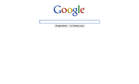
When you first load the page all that is displayed is the logo, the text box and the two buttons:

In other words, nothing but the absolute necessary for the visitor who just wants to search. The text box has the focus, so you can simply type away. (I’ll leave the reader to consider where the “I’m feeling luckly” button fits in all of this minimalism).
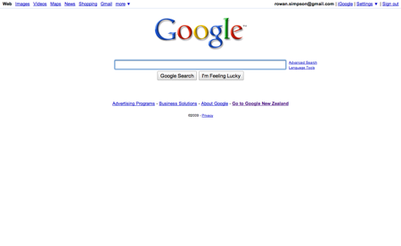
If you move your mouse then all of the other links are revealed, with a subtle fade-in:

I can’t decide if this is clever or too clever.
What do you think?
