John,
I’ve watched your video which describes the reasons you believe we should change the flag.
I am one of the many New Zealanders who strongly agree with you.
I know there are some who have dismissed this whole process as a waste of money and a distraction from other more important issues. I don’t agree with that. I believe we are all capable of doing more than one thing at a time and actually I believe the symbols we use to represent ourselves on the international stage are important and worthy of discussion.
It’s well publicised that your preference is for a design featuring the silver fern. The fern is a symbol we should all be proud of, and indeed my own submission to the design process was a simple silver fern design on a black background (what a shame that we let terrorists and pirates steal that option from us).
However, as shown by the English Rose, Scottish Thistle and South African Springbok & Protea (as well as many many others) it is possible to have a strong and widely recognised national symbol without necessarily having it represented on the national flag. Indeed all three of those countries have simple and distinctive flags which are also well loved and recognised. Whether our new flag includes a fern or not will not change at all the fact that we use and will continue to use the silver fern symbol almost ubiquitously, everywhere from rugby teams, to coins, to war graves.
During the process of public consultation I learned a lot about what makes a great flag design. I’ll admit prior to this I wasn’t familiar with the term “vexillology”. Presented with new information, I changed my opinion. There were a lot of very average designs proposed, but there were some great ones too, including this, which I now consider the best of the bunch:

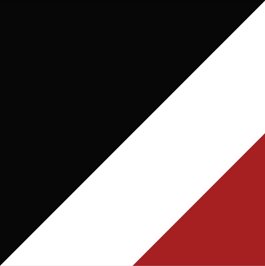
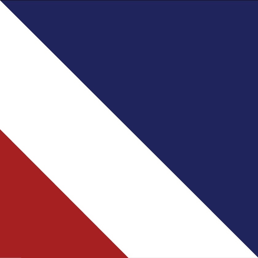
The Red Peak, by Aaron Dustin
https://aotearoaflag.tumblr.com/
This is a considered and elegant design.
It has a story, referencing the Maori myth of Ranginui and Papatuanuku.
It cleverly combines two halves.
On the left a nod to tukutuku panels, with the traditional colours of black, red and white:
On the right a reference to the stars and Union Jack from the current flag:
It is designed to be a flag, with a single black panel in the critical top-left corner, which is prominent when the flag is hung.
It does not look out of place when displayed alongside other great flags, as will often be the case
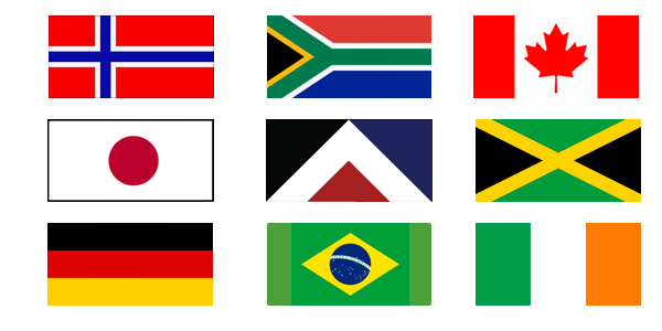
vs
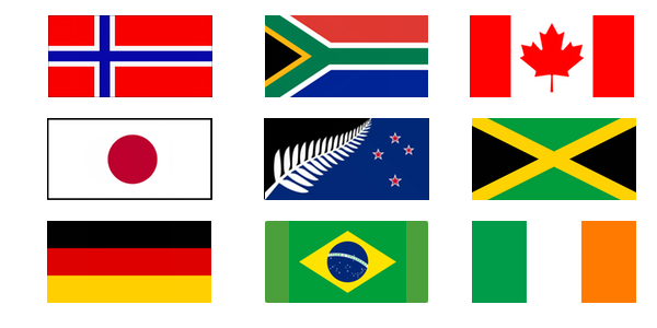
(yeah, nah!)
It works large and, importantly, small:

It is also very simple to draw, even for somebody with no artistic skills:
I was pleased to see this included in the long list and was looking forward to making the case for why this should be selected as the new flag design in the referendum process.
So, I was saddened and disappointed to see the four designs which have been selected for the short list.
I know you want this to be a democratic process, but frankly, given those choices it feels like no choice at all, since three of the designs are so similar and two are identical except for substituted colours. At the moment it’s like being asked to choose between a Carl Jr, a Big Mac, a Whopper and … actually I don’t know the burger equivalent of the hypnoflag, so I’ll leave that to your imagination.
To win broad support, a challenger product or service needs to be remarkably better than the status quo (e.g. selling something on Trade Me vs using traditional newspaper classifieds). I worry that none of the options which have been put up will succeed on that basis. Even as a strong supporter for change, I don’t believe any of these four designs are good enough. But, worse, I worry that one of them will be preferred over the current flag anyway.
You have set this process up, and you (and probably you alone at this stage) have the ability to change it.
I ask you to reconsider the short list, to replace one of the two identical silver fern designs with Red Peak, and at least give us the option to choose.
Regards,
Rowan