There are only two industries that refer to their customers as users: high tech and illegal drugs. Is this the company we want to keep?
Early in 2001 we completed a major update of the Trade Me website, including a brand-new user interface. We started using the now iconic Kevin the Kiwi logo, drawn by Nigel. Kevin was originally brown, as you’d expect, but once we settled on the bright yellow-and-orange colour scheme for the rest of the site we decided he needed to be blue.
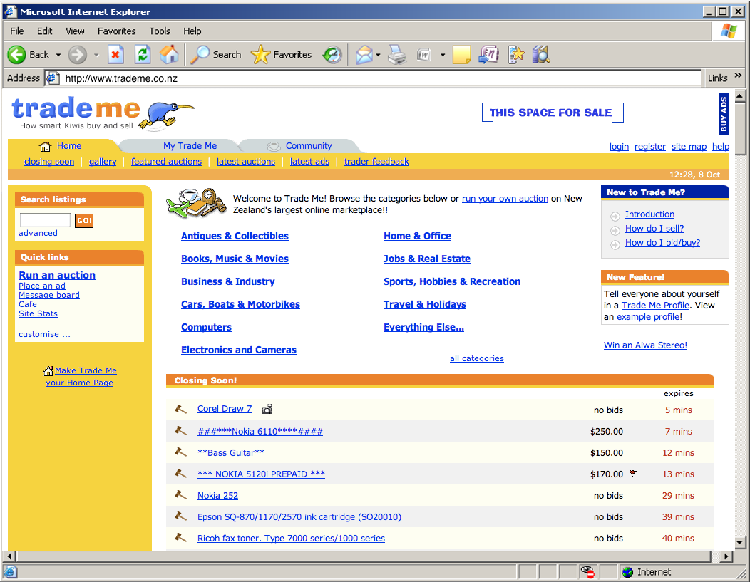
Shortly after the relaunch I was talking with a well-known designer who worked for a large corporate. He condescendingly described our new look and feel as “Tommee Tippee”, in reference to the popular brand of baby bottles. I was initially offended. After I thought about it, I decided to take it as a compliment. We were aiming to build a website that could be used by anybody, including lots of people using the internet for the first time. It needed to be obvious.
To achieve that we relied on conventions: our logo was in the top left of every page and linked to the homepage; we used lots of tabs to represent navigation options; links were blue and underlined and contextual; buttons looked clickable. And some other less obvious design tricks: we used big fonts because they were easier to read and forced us to use fewer words; we were careful to never break the “back” button that inexperienced users depended on when browsing; and we understood that some people prefer to browse while others prefer to search (about 50:50 as it turns out) so we accommodated them both.
Being conventional is the opposite of being innovative. None of those things impress lofty designers. But we came to realise those weren’t the people we needed to impress.
Faster horses
Anybody building software starts with the same goal. We all want to have lots of happy customers. And yet, most software is terrible. It’s complicated. It’s unreliable. It’s bloated with options and settings, which often feel like a litany of secret handshakes we’ll never learn. And because those of us who build software are so rarely in the room with people who are using what we build, mostly these frustrations are invisible and overlooked, if not completely ignored.
According to Don Norman, usability legend and Apple’s VP of Advanced Technology between 1993 and 1998, there are three evaluations required at the inception of any new product:1
- Marketing - what people want
- Engineering - what can be built
- User-experience - how people like to do things
Most product teams don’t make these evaluations. We focus on the things we can build rather than the things we should build. Or we just ask users what they want. Even that is complicated.2
We need to aim higher. The challenge isn’t to make it possible for people to use our products successfully. The goal should be to make this the norm. Even first-time users should be able to simply follow their nose, make the obvious choices, and end up in the right place.3
Getting to the third user
They say there are only two industries who talk about users rather than customers – tech companies and drug dealers. Those of us selling software should always remember that every user is a real person. There is a pattern in software development that I’ve seen repeated so many times now that it’s worth codifying:
Imagine we are observing real people using the software we’ve built.4 The first user completely misses the seemingly obvious cues in the user interface. The button might as well be big and red and flashing, but they just don’t see it. “Dumb user,” everybody thinks. The second user also soon gets hopelessly lost. “Two stupid users in a row! What are the odds?” The third user? Same story. At this point, we’re all hopefully slapping our foreheads and thinking instead, “How could we do this better?” The key is getting to the third user. Until then we haven’t really learned anything.
This exact same pattern applies to bug reporting, once the software we’ve built is out in the wild. The first alert can be written off as random noise. The second is annoying. The third is a sign that there are two problems: something is wrong with the software and something is wrong with the people who ignored the first two warnings. All of that assumes, of course, that we’re testing with real users and tracking errors or bugs in the first place. It is surprising how often that isn’t the case.
Rather than treating testing as validation, we need to have the mindset that we’re likely wrong and that users can teach us to be right.
Humble design
Having users invariably makes us wrong. Then, hopefully, it makes us humble.
People are complex. It’s easy to say we just need to imagine being in their shoes, or watch them while they use our software, or be more mindful of errors that are reported. But really we need to get in their heads and try to understand their context. We need to be aware of other tools they already use which will inform how they expect our new thing will work. That’s difficult and time-consuming work.
When we get carried away by the buzz of building something new, and get sucked into the challenges and complications involved in engineering and construction, it easy to forget our goal should be to build a “pit of success” 5 - a shallow hole that people will just immediately fall into without even having to think about it, ideally without even realising it, and which leads them in the correct direction. We need to make this the path of least resistance, like a water slide. Once we get people moving they should gather momentum and slide on down.
(When we see people repeatedly taking a different route then we should also pay attention to that, rather than putting up fences to stop them going that way – sometimes they’ll be directing us to a different and better product.)6
If we don’t have happy users, it’s not their fault. It’s our fault. We didn’t make it easy enough. We can do better. It’s not what the software does, it’s what the user does that matters.
-
The Secret of Apple Design, MIT Technology Review (via Internet Archive), May/June 2007. ↩︎
-
Henry Ford apparently said “If I asked people what they wanted, they would have said a faster horse”. I’m not sure. As a horse owner, I’d prefer a horse that eats less and poos less. They are fast enough! ↩︎
-
Set It and Forget It: How Default Settings Rule the World, by Lena V. Groeger, ProPublica, July 2016. ↩︎
-
The book I’ve most often recommended to anybody building a software product is Don’t Make Me Think by Steve Krug. It’s dated now (it was originally published way back in 2000, although there is a revised edition from 2013), so most of the examples are throwbacks to a previous era of web design, but read it just for the simple explanation of usability testing. ↩︎
-
I first discovered the “pit of success” via Jeff Atwood: Falling into the pit of success.
But I believe it was first described by Rico Mariani at Microsoft Research, quoted here by Brad Adams:
↩︎In stark contrast to a summit, a peak, or a journey across a desert to find victory through many trials and surprises, we want our customers to simply fall into winning practices by using our [software]. To the extent that we make it easy to get into trouble we fail.
-
Desire paths, Wikipedia. ↩︎
Related Essays
Product Management
Try to complete as many loops as possible, getting a little bit better each time.
Being Spartan with Ideas
Do you leave your ideas to fend for themselves in the wild or keep them in a safe place?
Continuums
What do we gain and what do we lose when we treat the world as binary?
Preaching to the choir
Do we prefer easy and confortable conversations or hard and unconmfortable ones?
Buy the book