I’ve been interested to watch the response to the new Trade Me design, which was launched this past week.
There has been a pretty caustic reaction on the message boards, with some long time members getting a bit worked up.
It’s amusing, from the outside at least, to see everybody asking for the old design back, forgetting that they hated that design too when it was first launched.
This is not the first time that Trade Me has changed the design of the site.
In fact, it has only ever changed.
There was a good article in Slate earlier this year about the controversial Facebook re-design, which I think is relevant:
How can I be so sure that you’ll learn to like the re-design? Because you did the last two times Facebook did it. In 2006, Facebook added the original news feed to its site. People hated it. They said the feed cluttered their home pages and violated their privacy. [CEO Mark Zuckerberg] responded with a blog post titled, ‘Calm down. Breathe. We hear you.’ Facebook tweaked the feed a bit, but the redesign stuck. Zuckerberg’s instinct was right on. In time, the news feed became Facebook’s signature feature, the part of the site that everyone checked first. Last summer, Facebook redesigned its front page to give more weight to the news feed. Again, millions protested. But once more, people learned to love the new site—stats show members started using Facebook more often.
That’s an important lesson: watch what people do and react to that, rather than paying too much attention to what they say they are going to do.
The numbers will quickly tell you if you’ve got it right or messed up!
I remember when Nigel was working on a tab re-design, to accommodate a new “Sell” tab. I was quite fond of the existing design and thought it looked better with only four tabs. But, luckily he didn’t listen to me, because that change turned out to be one of the single most successful design changes ever made to the site (and blindingly obvious in hindsight).
So, with my past track record in mind, there are three things about this latest design that I think are noteworthy:
Does mark-up make a difference?
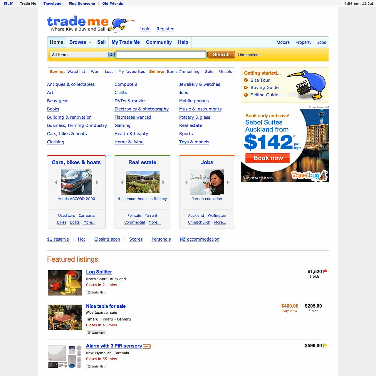
Trade Me have called the new design a “clean and modern layout”.
Maybe tabs that actually look like tabs are now classical? I’m not sure?
Is fixed-width the new black? On the surface at least, it’s a bit ironic to move to a fixed-width design in response to larger screen sizes. On the other hand, I’m sure that working with a fixed size canvas will make it significantly easier to make design changes to the body of pages in the future.
I wonder if most of the cleaning and modernising they are talking about has actually occurred under the covers.
The HTML that makes up the new home page has changed significantly.
The