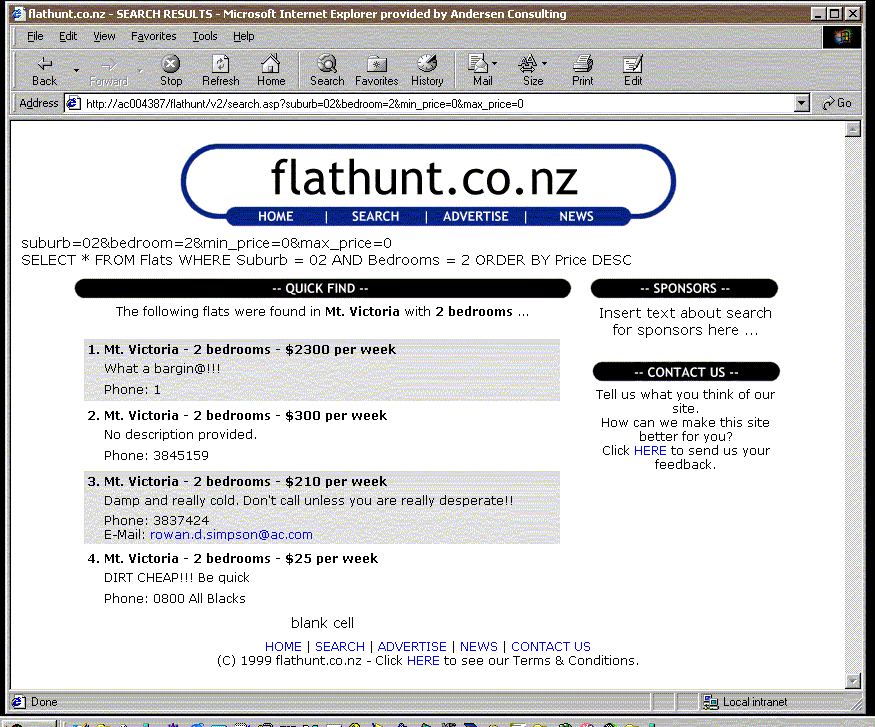
An old friend sent me this piece of nostalgia:

This screenshot was taken in late 1999, shortly before launch.
If you look closely you can see some SQL debugging code and even a “blank cell” at the bottom. All of the click HERE links are also a special touch.
Anybody else remember this old design?
Looking back, I can’t believe that I quit a perfectly good and well paid job to do this!
Everybody who thought I was a bit mad was clearly right. I literally knew less than nothing when I started - because as lot of what I assumed I knew was wrong.
The very first feedback email I ever got was from a friendly stranger who explained why contextual links are generally better. You do well to only make each mistake once, I suppose.
It’s now just over 10 years since I started working on this stuff. That’s getting to be so long ago that it feels like a completely different time and place.
The web as it was back then is barely recognisable today: a relatively tiny population of connected users, the vast vast majority on dial-up (browsing with images turned off, to make it faster and cheaper was not uncommon); very primitive browsers which were rapidly evolving and quite unpredictable (CSS and JavaScript were only for the brave); tiny screen sizes (remember 640×468?); development tools and languages that required a bit of brute force; no conventions to build on or follow, etc etc.
The way we thought about the web back then, and what it took to create a successful site and successful business, is in some ways starting to look a bit dated too. Or, perhaps idealistic is a better word?
Here is one of the lessons that does still hold, I think:
The people who got up the learning curve the quickest were those that took off shoes and just jumped in, however unimpressive the initial things we were building seem looking back. Those that sat on the sidelines desperately hoping to come up with a great idea for a website, or worse, spent all their time refining a concept or design until they considered it good enough to actually show people, were generally left behind.
I think there are a lot of parallels with the web back then and the way that mobile applications are developing at the moment: there seems to be a new or improved platform every week; nobody really has any idea about the best way to present applications to users (Objective-C or HTML5?) or to try and make money from them; the conventions and standards in interaction design are to a large extent still to be discovered and agreed; there is only a tiny user base (I’m told there are now ~50,000 iPhones in NZ, compared to about 8x as many internet users in 1999); pricing is an evolving art; and yet as all of this is playing out there is a huge amount of innovation happening.
If I were a discontented 24-year-old today this is what I’d be working on.
Or, a reasonably contented 34-year-old, for that matter.
More about that soon:
