Distance doesn’t make everything seem small.
On Sunday 2nd September 2015 I published a short blog post about a flag design that would quickly become by far the most widely read thing I’ve written (so far, although I acknowledge it’s very likely a permanent high tide mark).
The next few weeks after that were an education. Here are three things I learned…
1. How to start a movement
One of the questions I love to ask founders about their startup is:
How will you overcome your obscurity?
It seems a simple question. But it’s tough to answer succinctly and coherently.
While many founders worry about others stealing their ideas in the early stages, a much bigger concern is realising that most people don’t care or (worse) don’t even know about us at all.
Every day startups die of starvation, due to lack of customers. Very few ever die of drowning from a deluge of customers they can’t cope with.
Our mantra at Trade Me was: 1
Build a great website and people will tell their friends
That’s just a rewrite of what it means to be remarkable. Literally, be something that people will choose to tell others about.
But how?
For us, back then, that meant obsessing about reliability and usability, even for people who were very new to the internet and likely connecting on a basic PC via a dial-up connection, and it meant injecting ourselves into the process of buying and selling only where necessary, but intentionally where it helped.
Our approach to marketing was unconventional. Once, in the early days, Sam called the producers at Fair Go and suggested they do a story about the risks of selling online. They didn’t really know what to say. They were more used to dealing with business owners who would lock the doors or try to punch the cameraman.
But they came and filmed some interviews. Then we panicked. We were not really prepared for the level of traffic that a top-rating prime time television show might generate. The site was still running on a single web server at that point, so we braced ourselves.
That night was the first time we ever had more than 1000 people browsing the site at once.
We learned that editorial is the best advertising. That turned out to be a winning strategy. We were able to ride the network effects that word-of-mouth referrals created, and in the process built a very large and profitable business in a very short number of years. The rest is history.
It was only later, with more context from working on different ventures, that I realised what an outlier Trade Me was in this respect. Very few startups have pure product-led growth the way that Trade Me did.
Here is another example…
In November 2015, 10.9% of voters in the New Zealand Flag referendum (just under 150,000 people) ranked the Red Peak flag as their preferred option.2 Just two months prior to that, it wasn’t even on the ballot and very few people had even heard of it.
To put this result in context, the largest party vote for a minor party in an MMP Election was in 1996 when NZ First received 13.49%. The Greens received 11.06% in 2011 and 10.70% in 2014. Since then no minor party has received more than 8% of the overall vote.
That’s remarkable!
How did it happen?
In early 2015 the government formed a panel of distinguished New Zealanders to select designs for a new national flag.3 From 10,292 public submissions, the panel selected a long list of 40 designs, then quickly whittled those down to a short list of four to take to a public vote.
Unlike most people, I’d been following the process from the beginning. I believe the symbols we use to represent ourselves on the international stage are important and worthy of discussion. I thought it was an exciting opportunity for change.
One of the designs included in the long list had caught my attention.
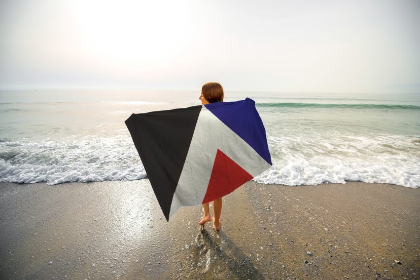
It was originally named First To The Light, designed by Aaron Dustin. We would eventually all come to know it as Red Peak.
It was a considered and elegant design.
It had a story, referencing the Māori myth of Ranginui and Papatūānuku and the geography of Aotearoa.4
It cleverly combined two halves. On the left a nod to tukutuku panels, and the Tino Rangatiratanga flag, with the traditional colours of black, red and white. On the right a reference to the stars and Union Jack from the current flag, with the existing colours of red, white and blue.
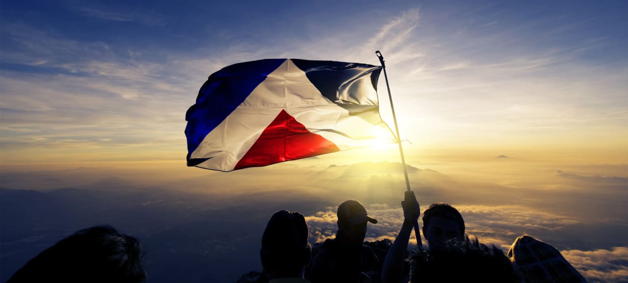
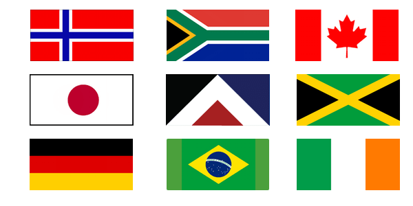
Possibly most importantly, it had been designed specifically to be a flag, with a single black panel in the critical top-left corner, which is prominent when it is hung from a pole. I imagined it flying on the top of the Beehive or draped over a winning athlete at the Olympics. It looked right at home placed alongside other great flags from around the world:
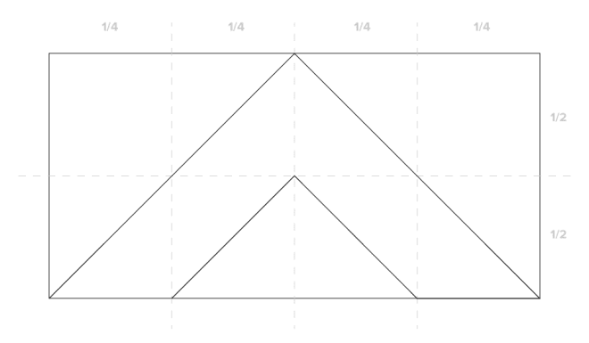
It was an uncomplicated design, so worked at any size - large or (importantly) small. It was a geometric design, so simple to draw, even for somebody with no artistic skills:
It ticked all the boxes, so seemed to me to be the perfect candidate.5 I was looking forward to making the case for why this should be selected as the new flag design in the referendum process.
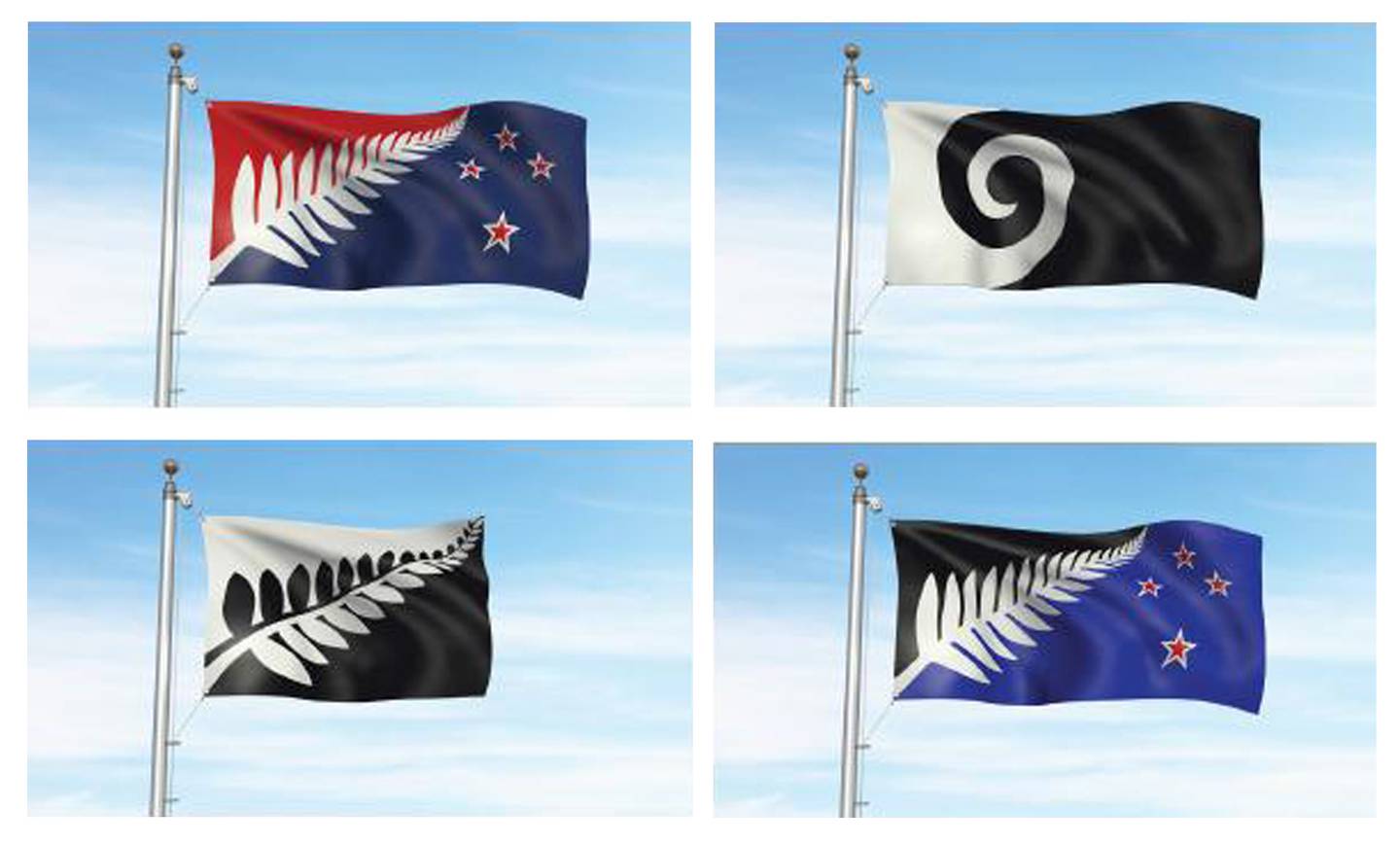
But when the short list was released I was seriously underwhelmed. Not only because this option wasn’t selected, but because of the four options that were:
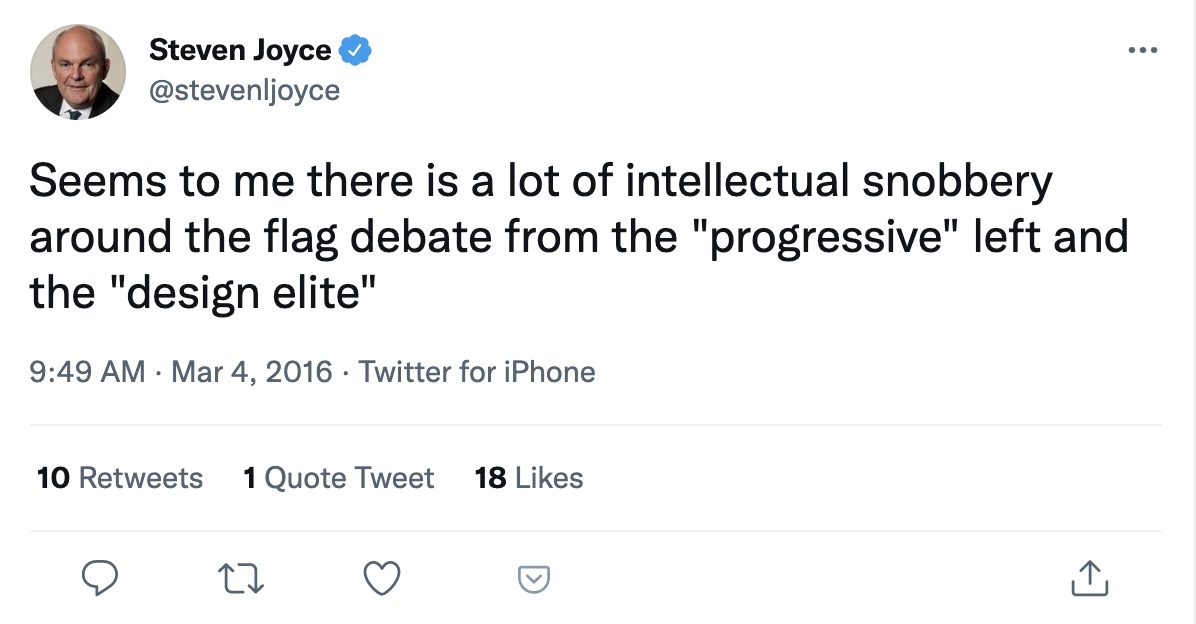
In typical GenX fashion, I did the obvious - shrugged my shoulders and channelled my dissatisfaction into a tweet: 6
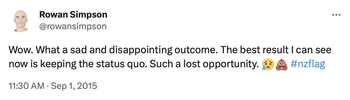
You can tell that I was both sad and disappointed - I included the sad face and the pile-of-poo emoji!
Curiously, that by itself didn’t make much of a difference, so I thought about what else I could do that might have an impact?
I did the next most obvious thing and published a blog post, which I facetiously addressed to the Prime Minister, John Key, with really low expectations:
I called it Dear John.7
With the benefit of hindsight, the first line should have been “How I hate to write… #BASF” 8
It was a simple post that expressed my frustration. I complained that we were promised four choices but in the end we’d been presented with a single solution - four variations of a fern - and were just left to choose colours.
I struggled to find a positive:
To win broad support, a challenger product or service needs to be remarkably better than the status quo (e.g. selling something on Trade Me vs using traditional newspaper classifieds). I worry that none of the options which have been put up will succeed on that basis. Even as a strong supporter for change, I don’t believe any of these four designs are good enough. But, worse, I worry that one of them will be preferred over the current flag.
I published that on a Sunday afternoon.9
Later that night, I was surprised to see it had already been shared about 250 times. It was, with the benefit of hindsight, just enough to escape my immediate circle. Over the next 72 hours it went nuts on social media. It was shared over 100,000 times on Facebook and was widely read.10
Then it was picked up by mainstream media. Toby Manhire published a piece in the NZ Herald on Tuesday.11 By Friday I was interviewed on Radio New Zealand and TV3 news.12
It reached the press gallery later that day. John Key was asked about it, and dismissed it completely.13
However, what happened next was wonderful. There was an amazing and delightful creative response online, as people took the design and applied their own thinking. The things that were shared were inspiring and creative and crazy and fun.14
As a result many more people heard the story.
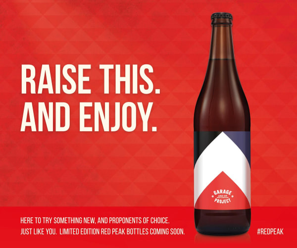
Earlier in the consultation process John Key had predicted that, once the flag was changed, New Zealand companies would incorporate the new design in their branding and products. He was correct about that, but perhaps not in the way that he intended:
The catalyst was just telling a story that engaged people and then getting out of the way.
It wasn’t premeditated. It wasn’t coordinated. There wasn’t a headquarters plotting the strategy. Most of us who were most vocal had never met and in many cases still haven’t. It was decentralised and chaotic.
Everybody was free to respond in their own way. Different people did different things. Some got traction and were amplified. Others, not so much.
This totally flummoxed politicians and those who tried to interpret everything via their tribal political lens. At one point, on the same day, I was accused of running a left-wing conspiracy and a right-wing conspiracy.

I discovered an abstract design is like a giant inkblot test. Some people saw a volcanic cone at sunrise. Others saw a nazi swastika.15 Some latched onto the conspiracy that Red Peak was covertly copied from an US engineering firm’s logo. That was especially ironic when this story was first reported on TV3, given their logo at the time:
Others couldn’t see past the triangles.
Each person’s reaction actually said more about them than about the design itself.
When any of the great flags are reduced to their shapes and colours they are also meaningless. The Japanese flag is just a red circle. The French flag (like a lot of other so-called “triband” flags for that matter16) is just three rectangles. The Union Jack is just some lines and triangles. The Stars & Stripes is … stars and stripes. In every case it is the story attached to these shapes and colours which give all these flags great meaning. It was the same with Red Peak.
This is why it’s no surprise that when asked, based just on the shapes, Red Peak didn’t rank very highly in public polling. It was like asking people to choose their favourite singer just based on a photo. But it’s also why, once people were given the opportunity to consider it in context, it resonated with so many and became their preferred option.17
Some people were only convinced when they saw the flags physically flying. Perhaps the most satisfying thing for me during this time was seeing that happening in lots of different places around the country.
Some people started a petition. More than 50,000 people added their name in support. Within a week of publishing the blog post, I found myself in a media scrum on the steps of Parliament. Four politicians all agreed to publicly receive that petition and advocate for Red Peak, including Marama Fox (Māori Party) and David Seymour (ACT), who were the leaders of the Government’s coalition partners at the time, plus Gareth Hughes (Greens) and, future Prime Minister, Jacinda Ardern (Labour).
From there, it really snowballed. The media continued to amplify the story. On 23 September 2015, just three weeks after the blog post, Parliament sat under urgency to change the law and include Red Peak as a fifth option on the ballot.
Every movement begins with a vocal minority. But not every vocal minority creates a movement.18
Overcoming obscurity only seems easy in retrospect:
Be remarkable and tell the story. But most importantly show others how to follow then get out of their way.19
2. Separate the source and the echo
Initially, the idea of Red Peak was dismissed, because it came from Twitter and Facebook rather than “credible” sources. It wasn’t taken seriously because it was seen as a product of a “social media echo chamber”. The assumption was this audience was a tiny vocal minority - a.k.a. the “Twitterati”.
I found this really confusing. The posts on social media that started the whole thing off were the original content. And they were shared on those platforms thousands of times and reached a large audience there. The media stories that pointed to them later were simply re-publishing them after the fact, and sometimes literally just repeating the content without adding anything substantial to the story.20
What was the source and what was the echo?
What is the difference between media and social media? Why does the latter have the qualifier?
The way we’re all using these different platforms has changed faster than the language we use to describe them.
At what point should we switch those names around, acknowledge that social media is now the dominant kind of media, where the majority of content originates, and start to add the qualifier to the older variant - for example traditional media, or broadcast media?
Retronyms like this are not new. What we previously called electronic mail or email is now more often just called mail. And we’ve renamed the old kind of mail to snail mail or “post”.21
What we used to call a smart phone is now just a phone, or more accurately “device”. And we’ve renamed the other kind to “landline”.
Some others things are transitioning right now:
- English → British English
- Writing → Handwriting
- Books → Paper Books
What’s next after those?
I wonder how long before we start to add a qualifier to petrol cars, unassisted bikes, dairy milk or cell-based meat?
Perhaps in the past where something was published gave a clue to the quality of the idea. But the lines have blurred considerably. We need to be careful not to dismiss an idea just because it was shared first on social platforms. We need a better way to identify and distinguish expertise…
3. How to identify an expert
Every interview with a public figure should include the question "what have you been wrong about and how did it change your views?" The answer shows if the person is intellectually honest or a tale spinner with delusions of infallibility.
It might surprise you to discover that, despite what happened, I’m actually very fond of the silver fern.22
It is an enduring and unique symbol. It’s widely associated with New Zealand and New Zealanders, and is the only symbol most of us would pick if we had to choose a single icon to represent our country.
The history here goes back even deeper into the archives.
In 2009 I published another blog post where I argued that we should run a process to change the flag, and even suggested a specific alternative: 23

I submitted this design for consideration in 2015. I still believe that if the panel had been brave enough to include a simple “silver fern on black” design such as this in the shortlist it could have been a very different debate.
However, it was ruled out because of another famous fern we’re all familiar with: 24

Here are 15 more selected ferns used by different sporting organisations:

(Bonus points if you can name them all without using Google).
While it is most commonly associated with our sports teams and specifically with the All Blacks, the Silver Fern goes much wider than that. It’s extensively used, in business and trade, tourism, on our money and our passports, and on the headstones that commemorate our fallen soldiers.
However, the dilemma that any designer faces when trying to include a fern on a flag is that it’s hard to design a good fernthat is visually distinct from all the others already in use. The only way to do that is to include some colour or other elements, which very quickly leaves you with a compromised design.
Also, flags need to fly next to other flags. In our case that means the national flag will often need to fly next to these other ferns, creating what could be called a “cluster fern”.25
It’s what we learn, after we know it all, that counts. Before the long list was published in 2015 I expected the winning design would be a silver fern. But the more I learned about vexillology (I’ll admit I’d never heard of that previously) and what makes a great flag design the less I knew.
The problem is seldom people who don’t know what they are talking about. It’s people who think they do, when they really don’t.
#8 wire nation
Aotearoa is the #8 wire nation. We’re proud generalists - good at most things, not great at any one thing. This is one of the reasons why we have more than our fair share of founders and inventors, but also why we are quite poor at scaling things to become international successes. We celebrate punching above our weight, without any regard for what normally happens to underweight boxers who fight larger opponents.
The dark side of generalism is our tendency to rebel against sophistication and to be suspicious of expertise.26
Somehow, when they put together a group to select a new flag design, the politicians thought it appropriate to include business people, mayors, reality television producers, as well as former All Blacks and Olympians. They failed to include a single designer.
As a result, expert opinion was trumped by public opinion.27
Design is a curious thing. We all have an opinion on design, whether we’re qualified to or not. We make the mistake of thinking that every opinion is equally useful. Malcolm Mulholland, a member of the Flag Consideration Panel, said “most people we spoke to struggled with abstract designs”.
Often it’s hard for those of us who are unqualified to explain exactly why we like one design or don’t like another.
Experts can explain.
Remember, this is what makes an expert an expert. They have progressed beyond the complexity to the simple on the far side.
For example, in this case, experts can pretty quickly and easily explain the difference between an emblem and a flag:
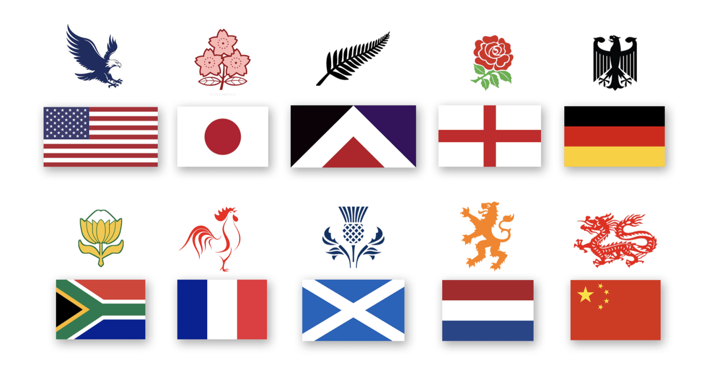
The English Rose, Scottish Thistle and Irish Shamrock are all iconic and widely recognised national emblems. All three of those countries also have simple and distinctive national flags, none of which include those emblems.
The Silver Fern is our own world class emblem (and that’s not a phrase I use lightly.)
Sadly, we missed the opportunity to complement it with an equally world class flag, because we ignored expert advice and insisted the design include our emblem.
This is the process that I went through in 2015. It’s very easy to follow:
- Have an opinion
- Listen to experts
- Revise that opinion, as needed
The important steps are #2 and #3.
Try to differentiate between perspective (an opinion to consider) and advice (direction from somebody who is qualified to give it).
Don’t be distracted by the reckons of random columnists or commentators. Seek out experts who can explain the “why”. Take advice from people who have earned the right to have an opinion.
Always ask what it would take to convince you to change your mind.
Then have the courage to do that when you need to and the grace to give others credit for doing the same.
Postscript
Is there another chapter still to be written in this story? Who knows? In the end the whole campaign to change the flag ended with a majority vote for the status quo. Given the process and options eventually presented to voters, that didn’t surprise me.
My personal view: of course we should change the flag, we should change the name of the country, we should change lots of things. But those should probably all be wrapped up in a much bigger discussion and be considered together.
The flag referendum was presented by the politicians who were advocating for change as a “once in a lifetime chance”. Perhaps that’s correct. In which case, I’ll leave these notes here for future generations to reference when that chance comes again.
I remain hopeful that I’ll still be here to see some of these changes happen.
In the meantime, the snow glows white on the mountain tonight.28
Conceal don’t feel, etc.
-
Trade Me Manifesto, September 2007. ↩︎
-
In the first round of voting 8.77% ranked Red Peak #1, this increased to 9.73% in the second round and 10.90% in the third round, before it was eliminated in the preferential ranking process. ↩︎
-
The Flag Consideration Panel, February 2015. ↩︎
-
A New Zealand Flag, by Aaron Dustin. ↩︎
-
Principles of Flag Design by Stand for NZ, YouTube, 2015. ↩︎
-
Rowan Simpson, Twitter, 1st September 2015. ↩︎
-
Dear John, advertisement for BASF recording tapes, directed by Tony Williams, ~1981. ↩︎
-
Despite what it might say on Wikipedia, I wasn’t the first to publish this sort of response. For example, a short post by Toby Morris the previous day also referenced Red Peak, as well as alternatives submitted by notable designers such as Kris Sowersby and Michael Smythe amongst others. It included this perfect commentary of the shortlisted options:
↩︎This flag says “this country is here to kick arse”.
The fern flags say “this intermediate hockey team missed the bus”. -
↩︎OH "it's no basmati rice, but your flag tweet is popular"
— Rowan Simpson (@rowansimpson) September 3, 2015 -
Let’s run up the red flag, by Toby Manhire, NZ Herald, 4th September 2015. ↩︎
-
Social media provides platform for flag design change, Radio New Zealand Morning Report, 7th September 2015. ↩︎
-
Key rules out adding Red Peak to referendum, by Dan Satherley, TV3 News (via Internet Archive), 7th September 2015. ↩︎
-
My favourite: Red Peak CSS. ↩︎
-
NZ First Likens Red Peak Flag to Nazi War Symbol, TVNZ One News. ↩︎
-
Triband flags, Wikipedia. ↩︎
-
Red Peak for New Zealand Flag, Change.org. ↩︎
-
The rise of Red Peak through social media, by Katie Kenny and Andy Fyers, Stuff, 15th September 2015. ↩︎
-
First Follower: Leadership Lessons from a Dancing Guy, by Derek Sivers. ↩︎
-
A non-Red Peak example: consider this story which is literally just a tweet explained:
Monica Lewinsky’s hilarious tweet about Clinton affair goes viral online ↩︎ -
Indeed, the follow-up to my Dear John blog post was titled: I <3 the Silver Fern. ↩︎
-
NZ Flag, 5th January 2009.
Curiously, one of the people who commented on that post at the time was Kyle Lockwood. He would, of course, later have two of his designs shortlisted, one of which was chosen by voters for the second round of the referendum. We have something else in common too: we are both old boys of Rongotai College. The criticism he received through this whole process was regrettable. ↩︎
-
Hands off our silver fern: New Zealand Rugby Union warned off flag committee over its trademarked symbol, NZ Herald. ↩︎
-
Something To Be Remembered For, by Farah Iqbal, Medium, 13th September 2015. ↩︎
-
David Cormack, Twitter, May 2018. ↩︎
-
Flag Panel not far away from public choice, UMR (via Internet Archive), 25th August 2015. ↩︎
-
Demi Lovato - Let It Go (from “Frozen”) (Official Video), YouTube. ↩︎
Related Essays
Inconvenient Values
Why is it so hard to articulate and document shared team values?
World Class
The expression “world class” gets casually thrown around, like a frisbee at the beach. But what does it really mean?
The Far Side of Complex
How do we get beyond complexity?
Buy the book